Revised changing left/right layout
Overview
If you have a working solution, you tend to use it for everything. This is also the case for Changing left/right layout from 50%/50% -> 75%/25%. Over time WEBCON BPS evolved and I understood more about the internal workings. This allowed me to find a better solution for changing the layout. It even allows to switch to a different layout depending on the selected tab.
Info: On WEBCON DAY 2023 we have seen something similar for the upcoming WEBCON BPS 2024 version. Maybe we won’t need this solution in the future. Nevertheless, this will take some time and in the meantime we can use this option. In addition, I shamelessly copied the idea with the “centered form”.
Implementation
A changing form layout changes which depends on the selected tab? Don’t despair, it’s easier than you think.
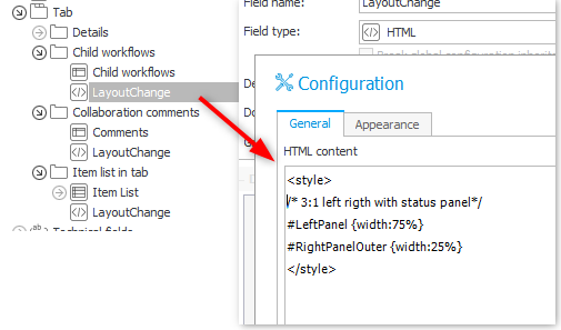
- Create an HTML field in the tab.
- Place the HTML content examples in the field.
- Hide the field name in the advanced configuration.
- Make the field visible in the field matrix.
Explanation
The reason, why this works is quite simple. Only the visible elements are actually part of the HTML DOM. This applies to all fields. The style of the field will therefore only be part of the DOM while the tab is selected. In addition to this, if multiple CSS rules define a style the last one loaded wins. Therefore, our HTML field is the last one and defines the current style. At least if you don’t have another field in the bottom place holder area of the form.
Examples
Left/right 75%:25%
<style>
/* 3:1 left rigth with status panel*/
#LeftPanel {width:75%}
#RightPanelOuter {width:25%}
</style>
Left/rigth 75%:25%; no info panel
Remark: This will enforce a hidden status panel. It won’t be visible even if the users click on the info. For some reason I didn’t get any negative feedback from the users.
<style>
/* 3:1 left right no info panel*/
#centerPanel {width:100%; padding-right:0px;}
.rightBar {display:none !important;}
#LeftPanel {width:75%}
#RightPanelOuter {width:25%}
</style>
Neither right nor info panel
Remark: This will enforce a hidden status panel. It won’t be visible even if the users click on the info icon. For some reason I didn’t get any negative feedback from the users.
<style>
/* full width  no status panel*/
.centerPanel {width:100%; padding-right:0px;}
.rightBar {display:none !important;}
#LeftPanel {width:100%}
#RightPanelOuter {display:none;}
</style>
Centered layout
I copied this idea from the future WEBCON BPS 2024 version. It is primarily useful for a dictionary like workflow.
In this case I created a CenterForm HTML field outside a tab and put everything visible in tho the top panel.
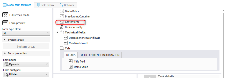
<style>
#main-form-page {max-width: 700px; margin-left: auto; margin-right:auto}
</style>
Info: I wanted to use the layout of small browser window where the labels are above the fields, but I couldn’t achieve this. If anyone finds a solution to do it, without defining the classes for bigger media queries, get in contact with me.
Comments