Adding grid to form tables
Overview
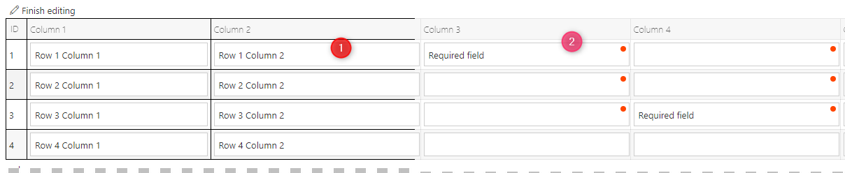
If you have large item lists with conditional required fields, it may get confusing which required field is empty. Adding a grid to the table will help the users. If it takes the selected theme into account, it’s even better.
Info: My original approach was to move the required indicator. The result wasn’t to my liking. Nevertheless, I added it to this post in case someone else can use it as a starting point.
Info: Data tables and item list share the same classes. Therefore, both will be subject to these rules. It may be possible to differentiate these, but I haven’t looked into it.
Implementation
Explanation
Video uses different border color
The provided rules use an opacity value of 10% rgba(0,0,0,.1) which results in a less prominent border color. In the video I used 100% rgba(0,0,0,1) so that the effect of the theming is visible.
I prefer the 10% opacity as this is works betters in case of editable tells, in my opinion.
Updating global CSS styles
When you update the global CSS styles you need to refresh the browser page. Clicking the refresh button on the form won’t load the new styles.
Theming
The theming utilizes the specificity of CSS, e.g. the most precise CSS rule will be used.
The current theme is applied by adding the theme class to the body tag. Adding a specific theme class to the CSS rules in the global CSS style will allow you to define theme specific rules.
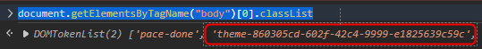
The easiest way to retrieve the current theme is executing the following JavaScript line in the developer tools.
document.getElementsByTagName("body")[0].classList
Info: I should update my posts where I’ve applied the theming in the form rules like the ‘Colorize path’. On the other hand I have a few more ideas for new posts and not enough time. :)
Approach without theming
Old CSS rule approach
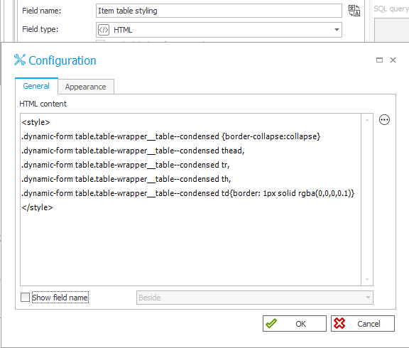
If you want to use it on a global level, add the following to the global CSS. Otherwise you can use the second option as the content of an HTML field.
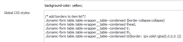
- Global css
.dynamic-form table.table-wrapper__table--condensed {border-collapse:collapse}
.dynamic-form table.table-wrapper__table--condensed thead,
.dynamic-form table.table-wrapper__table--condensed tr,
.dynamic-form table.table-wrapper__table--condensed th,
.dynamic-form table.table-wrapper__table--condensed td{border: 1px solid rgba(0,0,0,.1)}
- HTML field
<style>
.dynamic-form table.table-wrapper__table--condensed {border-collapse:collapse}
.dynamic-form table.table-wrapper__table--condensed thead,
.dynamic-form table.table-wrapper__table--condensed tr,
.dynamic-form table.table-wrapper__table--condensed th,
.dynamic-form table.table-wrapper__table--condensed td{border: 1px solid rgba(0,0,0,.1)}
</style>
New CSS nesting rule approach
This approach uses a relatively new CSS option which is still in draft but is already supported by a lot of browsers if you have an updated version Can I use nesting. This is far more readable and conserves bandwidth too.
- Global css
.dynamic-form {
  & table.table-wrapper__table--condensed {
    border-collapse:collapse;
    & thead, & th, & tr,& td{ border: 1px solid rgba(0,0,0,.1);}
  }
}
- HTML field
<style>
.dynamic-form  {
  & table.table-wrapper__table--condensed {
    border-collapse:collapse;
    & thead, & th, & tr,& td{ border: 1px solid rgba(0,0,0,.1);}
  }
}
</style>
Approach with theming
I’m only providing the global CSS rules for better readability. Scroll up, if you need to see the HTML field implementation.
Old CSS rule approach
body.theme-860305cd-602f-42c4-9999-e1825639c59c .dynamic-form table.table-wrapper__table--condensed {border-collapse:collapse}
body.theme-860305cd-602f-42c4-9999-e1825639c59c .dynamic-form table.table-wrapper__table--condensed thead,
body.theme-860305cd-602f-42c4-9999-e1825639c59c .dynamic-form table.table-wrapper__table--condensed tr,
body.theme-860305cd-602f-42c4-9999-e1825639c59c .dynamic-form table.table-wrapper__table--condensed th,
body.theme-860305cd-602f-42c4-9999-e1825639c59c .dynamic-form table.table-wrapper__table--condensed td{border: 1px solid rgba(0,0,0,.1);}
body.theme-a24dcfc2-2b14-4de8-8af3-7952a0a2cf61 .dynamic-form table.table-wrapper__table--condensed {border-collapse:collapse}
body.theme-a24dcfc2-2b14-4de8-8af3-7952a0a2cf61 .dynamic-form table.table-wrapper__table--condensed thead,
body.theme-a24dcfc2-2b14-4de8-8af3-7952a0a2cf61 .dynamic-form table.table-wrapper__table--condensed tr,
body.theme-a24dcfc2-2b14-4de8-8af3-7952a0a2cf61 .dynamic-form table.table-wrapper__table--condensed th,
body.theme-a24dcfc2-2b14-4de8-8af3-7952a0a2cf61 .dynamic-form table.table-wrapper__table--condensed td{border: 1px solid rgba(255,255,255,.1);}
New CSS nesting rule approach
body.theme-860305cd-602f-42c4-9999-e1825639c59c {
  & .dynamic-form  {
    & table.table-wrapper__table--condensed {
      border-collapse:collapse;
      & thead, & th, & tr,& td{
        border: 1px solid rgba(0,0,0,.1);
      }
    }
  }
}
body.theme-a24dcfc2-2b14-4de8-8af3-7952a0a2cf61 {
  & .dynamic-form  {
    & table.table-wrapper__table--condensed {
      border-collapse:collapse;
      & thead, & th, & tr,& td{
        border: 1px solid rgba(255,255,255,.1);
      }
    }
  }
}
Changing the required indicator position
My starting point for this post was the confusion which are can be caused by the required indicators. Therefore my first approach was to move them to the left. The below CSS rules achieves this and the results are looking good in read mode. If you switch to edit mode though, the layout gets disrupted by the margin. Without the margin the required indicator is placed on top of the first character.
.dynamic-form.modern .cell-is-required>div:before {
  content: "";
  background: #ff4500;
  position: absolute;
  width: 8px;
  height: 8px;
  border-radius: 50%;
  top: 5px;
}
.dynamic-form.modern .cell-is-required>div:after {
  display:none
}
.dynamic-form.modern .cell-is-required>div>div{ margin-left:10px}
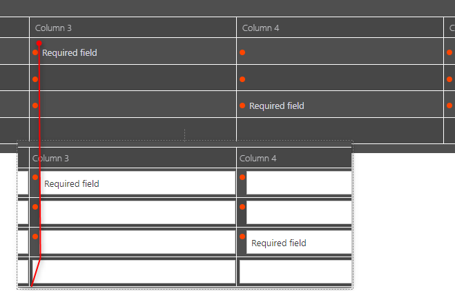
The results didn’t look promising. In addition, I didn’t even test how to differentiate between left and right aligned values. These are the reasons why I abondand this approach and added the grid layout.
Comments