Dynamic form layout change
Overview
While WEBCON BPS offers different options to define how much space the left and right column of a form should take up, this is a static option. I already described an alternative in the post Revised changing left/right layout. This option can be used for example to make the left column bigger, if a tab with an item list is selected.
With the new UI of WEBCON BPS 2025 it was necessary to review this topic.
Implementation overview
You might wonder, why I’m creating a new post for this instead of updating the old one. The reason for this is simple. While the solution did work fine, I made a big blunder. Ok, I wasn’t aware of it at the time, and it took me almost 1.5 years to realize, but that’s the way it is.
The blunder is, that I didn’t think that I would need to modify the CSS. In addition, I didn’t implement a way how I could identify all the HTML fields I would need to update.
The later one is really easy to fix, ones you think about it. Instead writing the CSS in HTML fields, I should have created constants for all the different layouts. Using this approach there will be only one place which needs to be updated. You can also read up on it here.
Therefore, the implementation consists of:
- Creating all the necessary constants
- Updating the HTML fields to use the relevant constant.
Constants for layout changes
I’ve created a group in the global constant called LayoutChange and added one constant for each layout type.
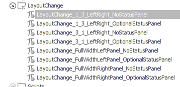
Below you find the values of each constant. I hope I won’t make any copy&paste errors.
Info: I will provide a screenshot for the last example only. In this one you can see the constant and the whole value.
1/3 left/right no status panel
Name: LayoutChange_1_3_LeftRight_NoStatusPanel
Description: 1:3 ration of the left panel and right panel. Status panel is hidden.
Value:
<style>
.centerPanel {width:100%;}
.rightBar {display:none !important;}
.toolbar-button__wrapper .infoBtn {display:none;}
#LeftPanel {grid-column: span 4 !important;}
#LeftPanel .grid-template__panel {grid-column: span 4 !important;}
#LeftPanel .grid-template__group .grid-template__panel {grid-column: span 6 !important;}
#RightPanel {grid-column: span 8 !important;}
#RightPanel .grid-template__panel {grid-column: span 8 !important;}
#RightPanel .grid-template__group .grid-template__panel {grid-column: span 6 !important;}
</style>
1/3 left/right optional status panel
Name: LayoutChange_1_3_LeftRight_OptionalStatusPanel
Description: 1:3 ration of the left panel and right panel. Status panel can be displayed by the user.
Value:
<style>
.centerPanel {width:100%;}
#LeftPanel {grid-column: span 4 !important;}
#LeftPanel .grid-template__panel {grid-column: span 4 !important;}
#LeftPanel .grid-template__group .grid-template__panel {grid-column: span 6 !important;}
#RightPanel {grid-column: span 8 !important;}
#RightPanel .grid-template__panel {grid-column: span 8 !important;}
#RightPanel .grid-template__group .grid-template__panel {grid-column: span 6 !important;}
</style>
3/1 left/right no status panel
Name: LayoutChange_3_1_LeftRight_NoStatusPanel
Description: 3:1 ration of the left panel and right panel. Status panel is hidden.
Value:
<style>
.centerPanel {width:100%;}
.rightBar {display:none !important;}
.toolbar-button__wrapper .infoBtn {display:none;}
#LeftPanel {grid-column: span 8 !important;}
#LeftPanel .grid-template__panel {grid-column: span 8 !important;}
#LeftPanel .grid-template__group .grid-template__panel {grid-column: span 6 !important;}
#RightPanel {grid-column: span 4 !important;}
#RightPanel .grid-template__panel {grid-column: span 4 !important;}
#RightPanel .grid-template__group .grid-template__panel {grid-column: span 6 !important;}
</style>
3/1 left/right optional status panel
Name: LayoutChange_3_1_LeftRight_OptionalStatusPanel
Description: 3:1 ration of the left panel and right panel. Status panel can be displayed by the user.
Value:
<style>
.centerPanel {width:100%;}
#LeftPanel {grid-column: span 8 !important;}
#LeftPanel .grid-template__panel {grid-column: span 8 !important;}
#LeftPanel .grid-template__group .grid-template__panel {grid-column: span 6 !important;}
#RightPanel {grid-column: span 4 !important;}
#RightPanel .grid-template__panel {grid-column: span 4 !important;}
#RightPanel .grid-template__group .grid-template__panel {grid-column: span 6 !important;}
</style>
Full width left panel no status panel
Name: LayoutChange_FullWidthLeftPanel_NoStatusPanel
Description: Full width of the left panel, right panel and status panel are hidden.
Value:
<style>
.centerPanel {width:100%; }
.rightBar {display:none !important;}
.toolbar-button__wrapper .infoBtn {display:none;}
#LeftPanel {grid-column: span 12 !important;}
#LeftPanel .grid-template__panel {grid-column: span 12 !important;}
#LeftPanel .grid-template__group .grid-template__panel {grid-column: span 6 !important;}
#RightPanel {display:none !important;}
</style>
Full width left panel optional status panel
Name: LayoutChange_FullWidthLeftPanel_OptionalStatusPanel
Description: Full width of the left panel, right panel is hidden. Status panel can be displayed by the user.
Value:
<style>
.centerPanel {width:100%; }
#LeftPanel {grid-column: span 12 !important;}
#LeftPanel .grid-template__panel {grid-column: span 12 !important;}
#LeftPanel .grid-template__group .grid-template__panel {grid-column: span 6 !important;}
#RightPanel {display:none !important;}
</style>
Full width right panel no status panel
Name: LayoutChange_FullWidthRightPanel_NoStatusPanel
Description: Full width of the right panel, left panel and status panel are hidden.
Value:
<style>
.centerPanel {width:100%; }
.rightBar {display:none !important;}
.toolbar-button__wrapper .infoBtn {display:none;}
#LeftPanel {display:none !important;}
#RightPanel {grid-column: span 12 !important;}
#RightPanel .grid-template__panel {grid-column: span 12 !important;}
#RightPanel .grid-template__group .grid-template__panel {grid-column: span 6 !important;}
</style>
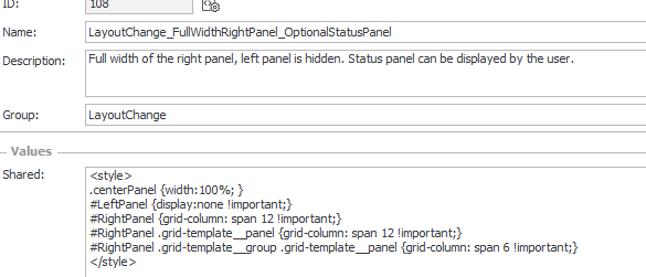
Full width right panel optional status panel
Name: LayoutChange_FullWidthRightPanel_OptionalStatusPanel
Description: Full width of the right panel, left panel is hidden. Status panel can be displayed by the user.
Value:
<style>
.centerPanel {width:100%; }
#LeftPanel {display:none !important;}
#RightPanel {grid-column: span 12 !important;}
#RightPanel .grid-template__panel {grid-column: span 12 !important;}
#RightPanel .grid-template__group .grid-template__panel {grid-column: span 6 !important;}
</style>
Using the new layout constants
That’s as easy as it can get.
- Create an HTML field
- Reference the constant
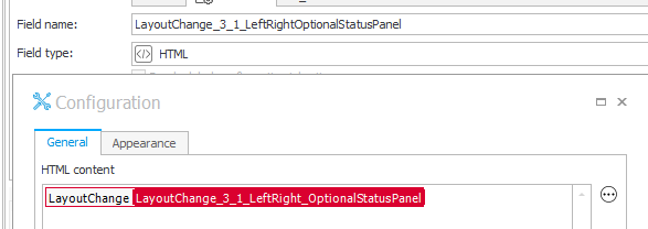
- Make the HTML field visible in the field matrix.
Info: If the field is not visible, the styling will not be rendered and the form layout will stay as it is defined on the global form template. Using this behavior, you could even use a different layout per step. For example, when an item list is no longer editable it takes up less space.
Updating the old HTML fields
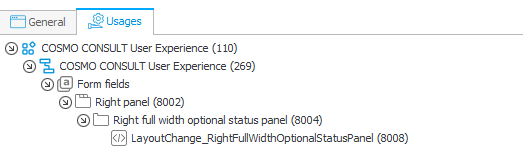
While we can’t make use of the Usages tab of the constants like in the new version not all is lost.
At least, if you have access to the database. The below SQL statement will output a list of all HTML fields which may change the layout.
select APP_Name, DEF_Name, WFCON_Prompt, WFCON_ID
from WFConfigurations
	join WFDefinitions on WFCON_DEFID = DEF_ID
	join WFApplications on DEF_APPID = APP_Id
	join DicWFFieldTypes on WFCON_FieldTypeID = TypeID
where WFCON_Config like '%#RightPanelOuter %'
	and ObjectName = 'HTML'
Remark: I’ve copied the like value #RightPanelOuter from one example of this post Revised changing left/right layout. You may need to test some other values to get all HTML fields.
Comments