Space horizontal fields in groups evenly
Overview
This post is based on a question DK asked in a comment. He or she had two choice fields in a group which are displayed horizontally. Depending on the content they don’t evenly share the space, which may lead to ‘interesting’ proportion. This post answers the question, which is simple to solve with CSS only.
Implementation
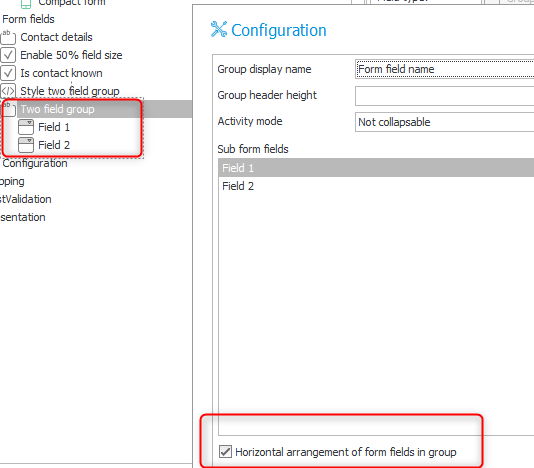
Group definition
That’s straight forward, just enable the horizontal alignment.
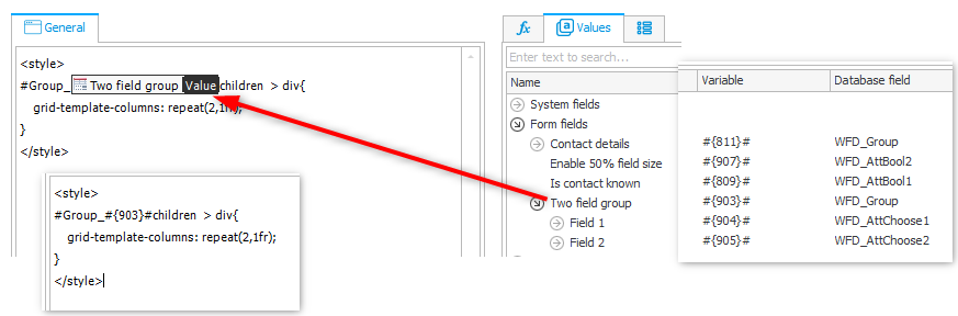
HTML field
Add an HTML field outside the group, otherwise it will take up a column, too.
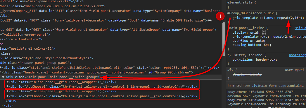
You can copy the below code and replace the variable value #{903}#` with the id of your group.
<style>
#Group_#{903}#children  > div{
    grid-template-columns: repeat(2,1fr);
}
</style>
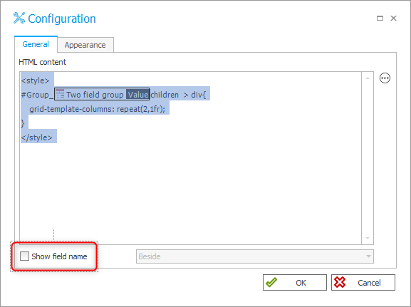
Don’t forget to deactivate Show field name
If you have more columns you can change the column number
/* two columns */
/*
#Group_#{903}#children  > div{
    grid-template-columns: repeat(2,1fr);
}
*/
/* three  columns */
#Group_#{903}#children  > div{
    grid-template-columns: repeat(3,1fr);
}
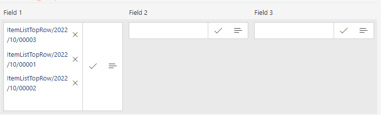
Field matrix
Don’t forget to display the HTML field.
Explanation
I have to admit, I don’t really understand the CSS grid options. I know they exist. so I asked ChatGPT to provide me with an example. My question was like this:
I have the following part of an html page
<div>
<div id="label1"/>
<div id="content1/>
<div id="label2"/>
<div id="content2"/>
</div>
How would the css be to display label1 and content 1 in a column and label2 and content2 in another column which both use 50% of > the space using CSS grid.
The final answer was:
.grid-container {
  display: grid;
  grid-template-columns: repeat(2, 1fr);
  gap: 10px; /* Adjust the gap according to your preference */
  box-sizing: border-box; /* to include padding and border in the width */
}
Taking a look how I could target the div group, so that the styling is applied, I noticed the Group_903children id. I used this to make sure, that the styling in the HTML field is only applied to this group. In addition I noticed that standard already display:grid. I only needed to overwrite the grid-template-columns property value. Since I used a more specific css selector, the default value is overwritten.
Off topic
During the Ask Me Anything event there was this question:
Where do you get inspiration from to get very creative with applications?
I replied with from questions.
This is just one of these examples, where a question lead to something useful for everyone.
I intend to answer the question with a post too:
Updated 2024-02-04: I answered this question with the post Adding a help page .
Comments