Uniform path button styling
Overview
The implementation approach should no longer be used. There’s a new revised version: Revised uniform path button styling.
This post describes an approach to style path buttons in a way that the style for all can easily be changed. It’s a follow up of a short version here.
- Add a unique identifier to each path button
- Create a style which uses the identifier
- Define global styles in an HTML field
- Define path types which are reused across all applications
Introduction
WEBCON BPS does a good job to provide a consistent user experience across all applications. Experienced users will easily be able to use any new application because they have a similar user interface and layout. Therefore they can concentrate on understanding the new application/process without wasting time to get used a even slightly different user interface. The understanding of the process can be improved by providing a preview of the workflow diagram and color coding paths.
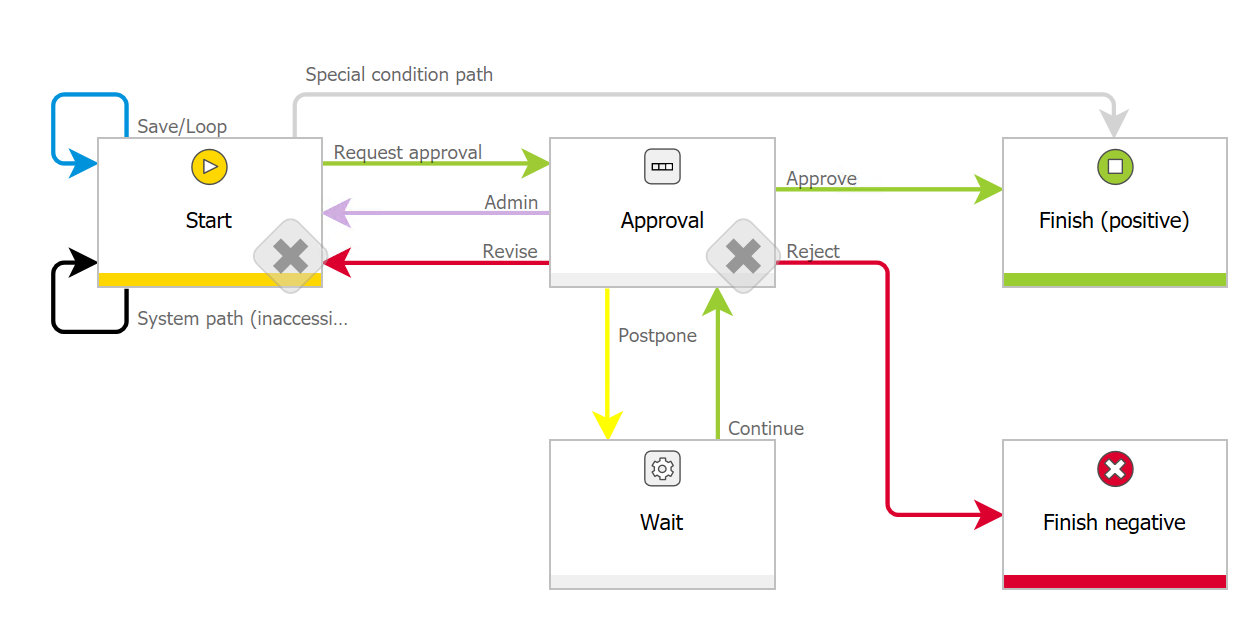
It doesn’t matter which kind of colors are used, but each color should be used for a single purpose across all applications. Therefore it’s important to write it down so that users as well as workflow designers can review it.
Current Situation
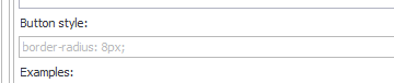
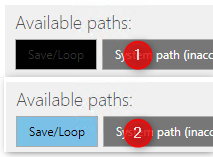
In addition to the defining colors for paths in the diagram it would be useful if the buttons would use a similar color, so the buttons reflect the path not only in name but in color, too. This can be achieved by defining Button styles for each path. In this attribute any valid CSS property can be set. The most important once would be background-color and color. The value can easily be chosen by using the developer tools of the browser or a color picker.
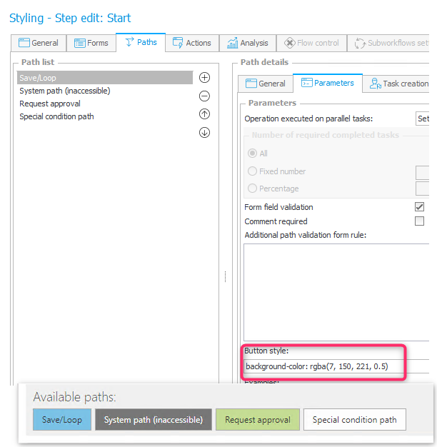
In addition to defining colors a border radius could be applied, to round the corners.
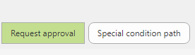
This can be applied for each button separately or on a global level.
Remark: If a button style is defined on path level this takes precedence above the global style definition. The global style is not applied.
There’s only one problem. If you define a style for each path button, what will you do if it has to be changed?
Improving path button styling
Challenges
The previously mentioned problem would easily be prevented if we could define global style which could be used for each path button. A change to this global style would apply to all buttons so we won’t have to be afraid of changes. If we would create our own web site we would define a CSS file with classes matching each path color which would be used for each button. As of today (2021-04-01) we can not define a class for a path button nor can we define a custom CSS file, but the later one is in backlog.
Defining path button styles once
The issue with the custom CSS file could be resolved using some JavaScript which loads the CSS file. This would also have the positive effect, that the browser could cache the file and doesn’t need to load it every time. On the other hand this is also a drawback, because it may lead to questions from users why they have a different style than others, only because the browser used an old cached version.
In addition to this the CSS file wouldn’t be part of the application export package and therefore the deployment needs to be taken care of, too. I prefer to avoid any additional deployment steps therefore I choose the following alternative.
- A global constant is added which value contains the style definition.
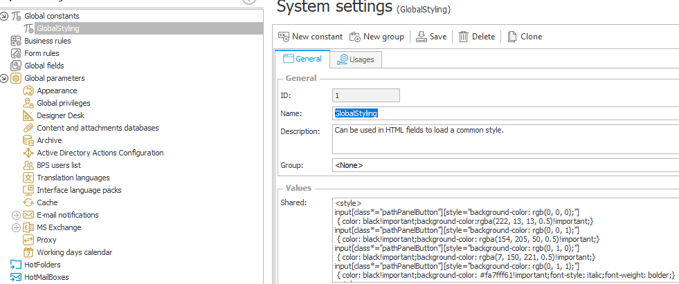
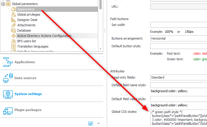
Global constant which contains the styles common for all applications - This constant is in turn used in an HTML field by which the constant value will be part of the DOM.
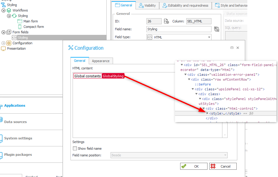
The constant value is part of the DOM
Remark: The styling field needs to be visible for the user. Therefore it can not be a technical field and needs to be visible on each step in the field matrix.
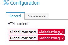
Remark: Only the first 2000 characters of a constant are copied into an HTML field, verified in version 2021.1.2.101. If you face this just create a second constant and use this one in the HTML field too.
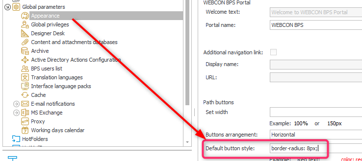
Remark: With the release of WEBCON BPS 2021.1.4.x an option has been added to define ‘Global CSS styles’. If you make use of this feature, you don’t need to add a ‘Styling’ field.
 b
b
CSS attribute selectors are the alternative to a CSS class
Even so it’s not possible to define classes in path button styles there’s an alternative. This is called attribute selectors. It allows us to identify a path button by the text value of a provided style and apply the style defined in the global constant to it.
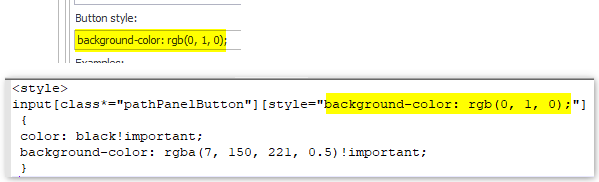
The result is that the color defined as a path button style is overwritten by our “class” due to the !important property.
The [class*="pathPanelButton"] is added in addition to reduce the likeliness of false matches.
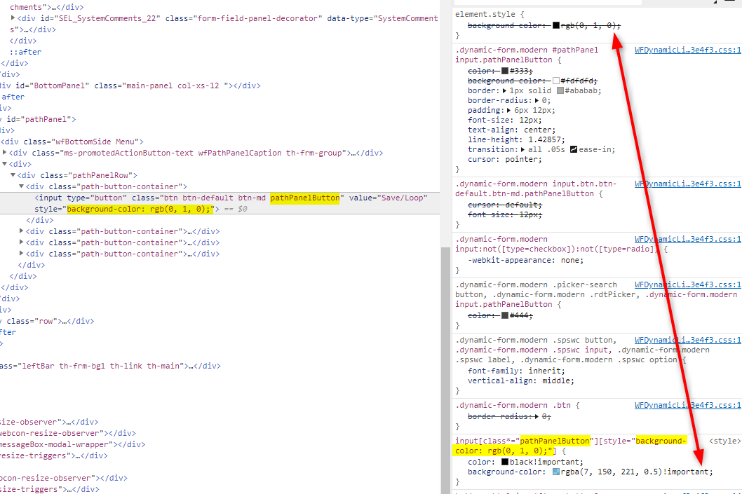
Remark: There’s one major draw back if attribute selectors are used. The selector matches each character. If one of the values contains an additional white space it won’t be matched.
Info: With the release of 2021.1.4.x not only the ‘Global CSS styles’ had been added, but the path buttons are now html buttons instead of inputs of type button. So there are folders for the different options you can choose from.
Color coding paths
All of this will only help the users, if the used colors follow a defined guideline. I will describe here my suggestion. I will start with the four colors which are available to every WEBCON BPS installation
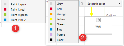
- Green
Is used for a positive action (path) which leads to another step / changes the assignments. This could be a request for approval, the approval itself or something similar.
Button style:background-color: rgb(0, 0, 10); - Red
Is used for a negative action which leads to another step / changes the assignments. This could be used for rejecting an approval or aborting a workflow.
Button style:background-color: rgb(0, 0, 20); - Blue
Is used for an action which doesn’t leave the step. It’s a loop/save path which does something to the workflow without any changes to the assignments.
Button style:background-color: rgb(0, 0, 30); - Grey
Any other path
Button style:background-color: rgb(0, 0, 40);
Starting with WEBCON BPS 2021
- Yellow
Is used to identify action which will postpone a workflow. The task is moved to a waiting step and will come back after a specified time.
Button style:background-color: rgb(0, 0, 50); - Black
Is used for paths which can’t be used by anyone. For example special path to initialize a sub workflow.
Button style:background-color: rgb(0, 0, 60); - Purple
A path which is only available in admin mode.
Button style:background-color: rgb(0, 0, 70); - Orange
I have no idea. Maybe red could be used only for destructive/final path while orange is used for reject/revise paths.
Button style:background-color: rgb(0, 0, 80);
While it’s nice to have more color choices in the diagram I’m not sure that all should actually be used. The more variations you are using the more the user has to remember which may lead to confusion.
I will stick with the four original ones plus one for administrative paths. Since red and green colors are associated with good/bad continue/cancel anyway, the users don’t need to remember their usage. So the normal users would need to remember only blue and gray. While gray can be anything.
Download
The style definitions can be found here.
With the release of 2021.1.4.x not only the ‘Global CSS styles’ had been added, but the path buttons are now html buttons instead of inputs of type button. So there are folders for the different options you can choose from.
Remarks
- If this option is used, there may be readability problems depending on the selected theme. I have yet to find a way to identify the loaded theme so that a different style could be used.
- The path colors haven’t been checked for accessibility in terms of color blindness.
Further User Interface/ User Experience recommendations
GoNextStage created guide containing a collection of best UX/UI practices for business applications design based on the WEBCON BPS platform. https://gonextstage.com/ux-guide/?lang=en
Comments